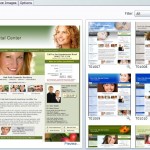
 The newest addition to our design library is the “Engage” series. In the "Portal Design" section underneath "Customize Portals," you can use the drop-down “Filter” box to view particular designs.
The “Engage” templates are striking designs that feature bold, rotating graphics and a simple, uncluttered layout.
You can choose which set of colors best suit your practice. Blue is popular, but some people prefer black or green.
In the “Engage” series, the appointment phone number is prominent. Like our other designs, there is menu navigation, a list of your geographic and dental markets, rotating promotions, and appointment and contact information.
If you scroll down, you’ll notice that a lot of different information is featured on the portal’s home page. In the “Engage” design, all of the practice’s doctors are listed right on the home page, and you can click to expand and see details about any doctor.
The “Engage” designs also feature a map, plus your office hours, and a photo of your office building. With this information on the home page, patients know right where you are and when you’re open.
On the left, you’ll see the portal’s Home Page Features. These are shown on the home page no matter which design template you choose. The same goes for the list of Practice Services – this list on the home page of every design – as is the link to The Top Things You Should Know List.
The “What Patients Say” section is another way the “Engage” series is different – it displays patient testimonials right on the home page. Finally, auto-generated text helps maximize your search engine optimization.
In the Control Panel, you can choose not to display sections. For example, if you uncheck the “Display on Portal” box in the top right corner of the “Testimonials” section, the “What Patients Say” box will disappear from your portal’s home page and navigation.
Of course, the “Engage” design isn’t right for every practice. The “Classic” design is very popular. It comes in lots of color combinations, and you can customize the banner image and rotating text.
The “Impact” design series has a large central image and simple, streamlined layout. Again, the images and text are totally customizable, and the design comes in a range of colors.
The “Contemporary” series blends elements of these two. There’s a large image, like in the “Impact” series, but the home page isn’t quite so minimalist.
In the “Engage” series, we pre-load a set of three images and slogans that relate to the portal’s dental market. These are selected automatically and cannot be changed.
You can update your portal’s design as often as you like in the “Portal Design” section. Try out a few different options to see which one is right for your practice. There are dozens of designs, and lots of ways to customize your web portal.